Three Monkeys Beer - Special Editions
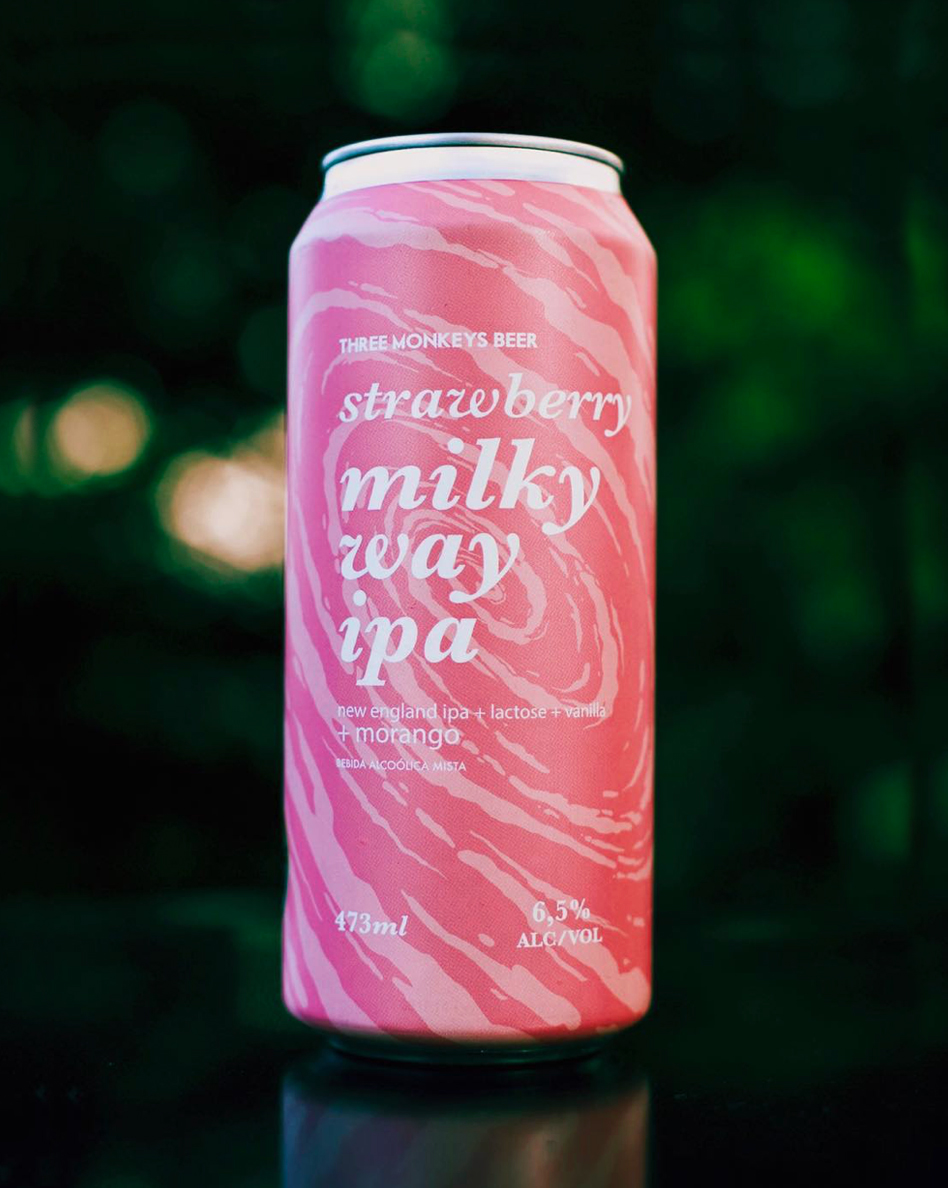
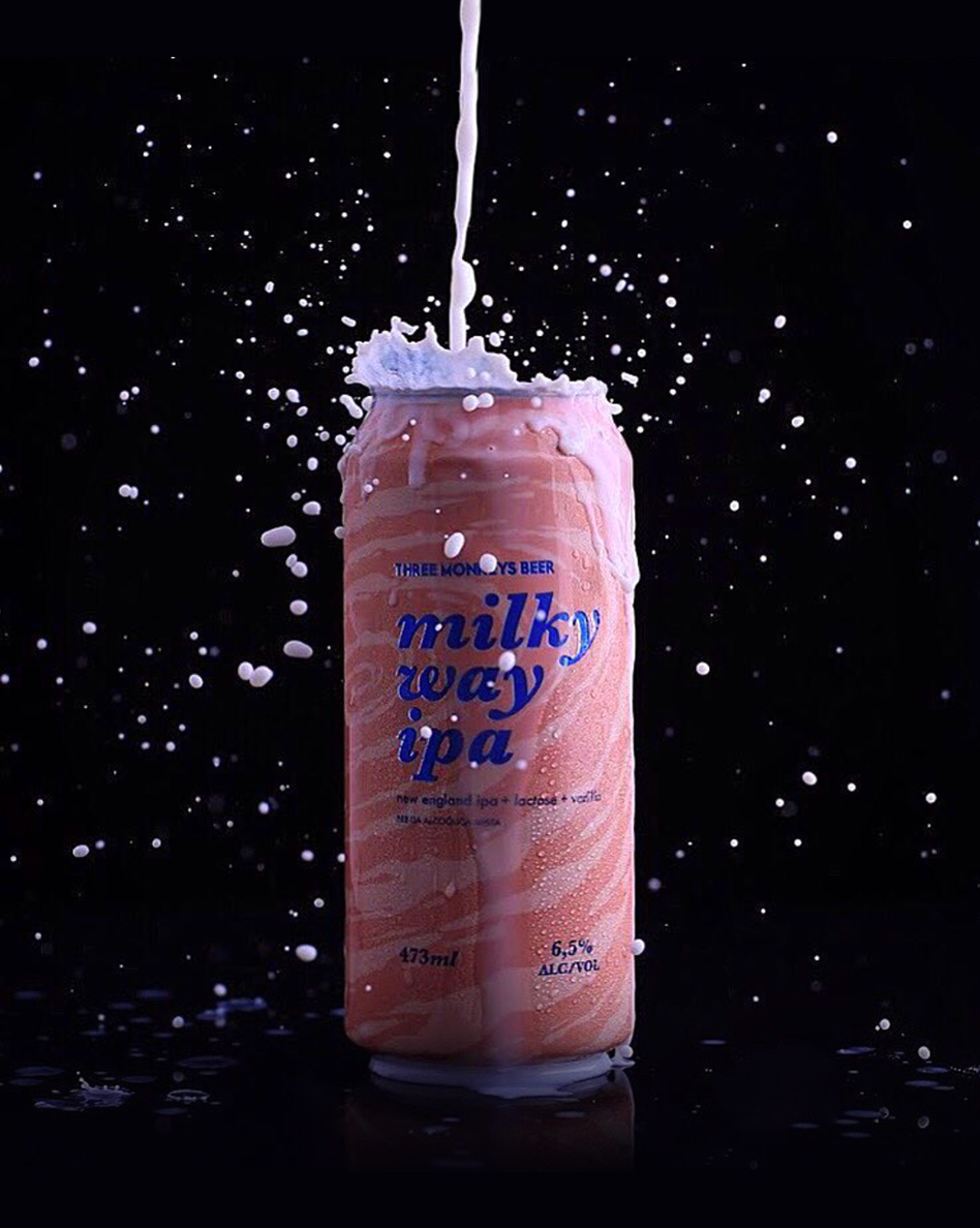
Three Monkeys Beer is an award winning micro brewery and one the first craft breweries to emerge in the Brazilian scene. Back in 2013 this three friends got together to try new beer recipes and challenge people's concept of what a beer should look and taste like
Within the last two years there has been a signifcant increase on the number of local breweries. With that the competition in the shelves of the markets has also increased. With that in mind we worked together on several of their special edition labels. Always trying to bring their young, irreverent and vibrant atitude to their products.
Role
Concept, Design and Illustration
Client
Three Monkeys Beer
Role
Art Direction, Graphic Design
Client
Unilever
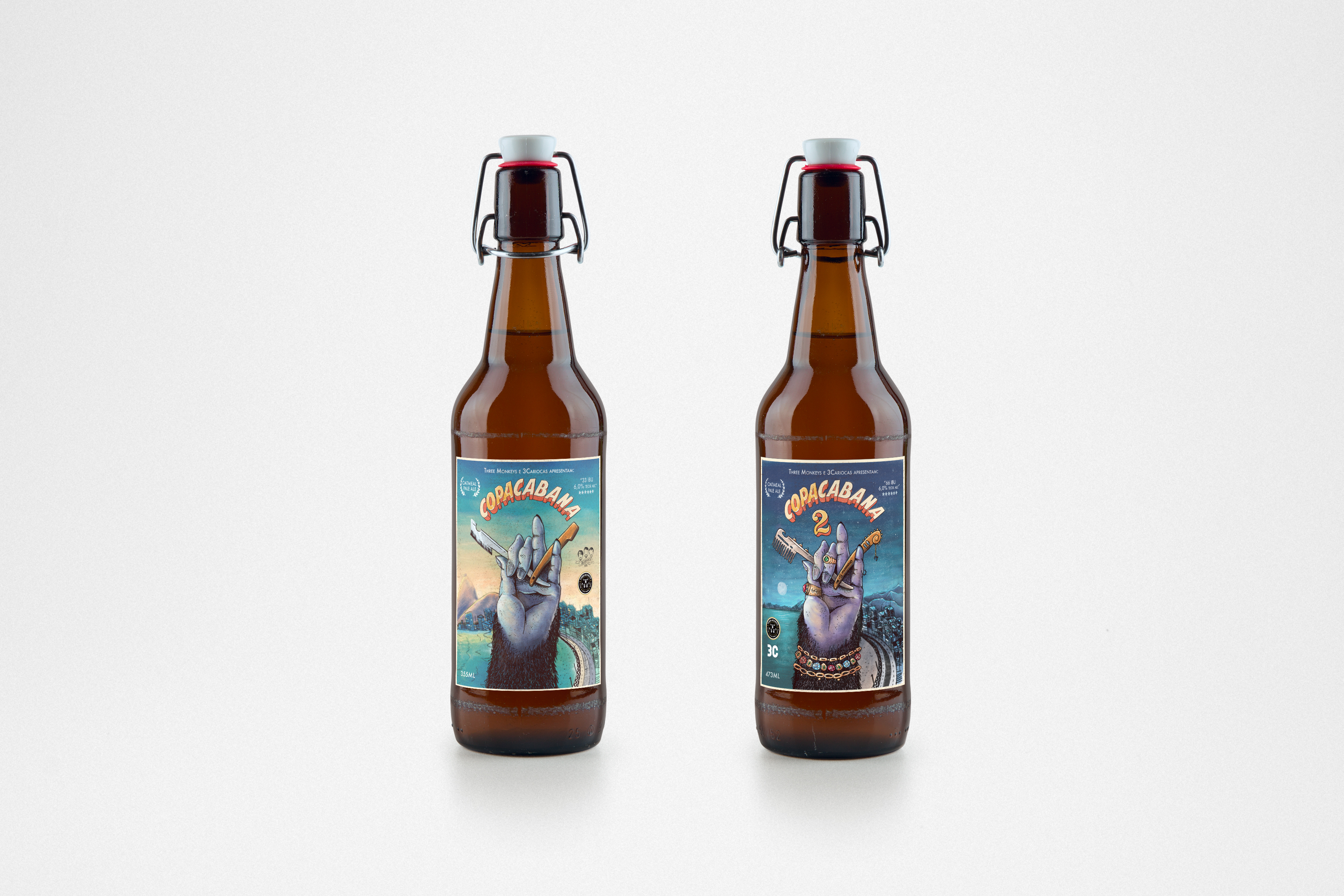
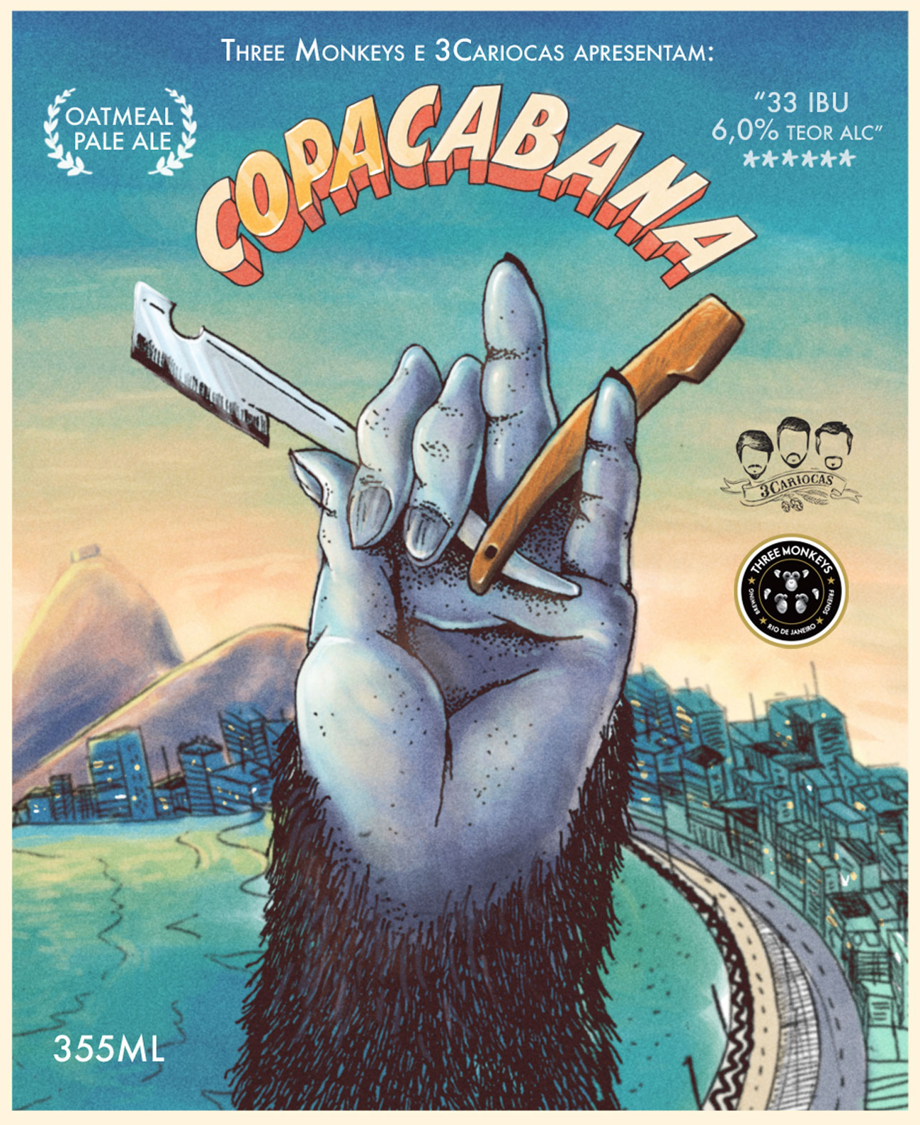
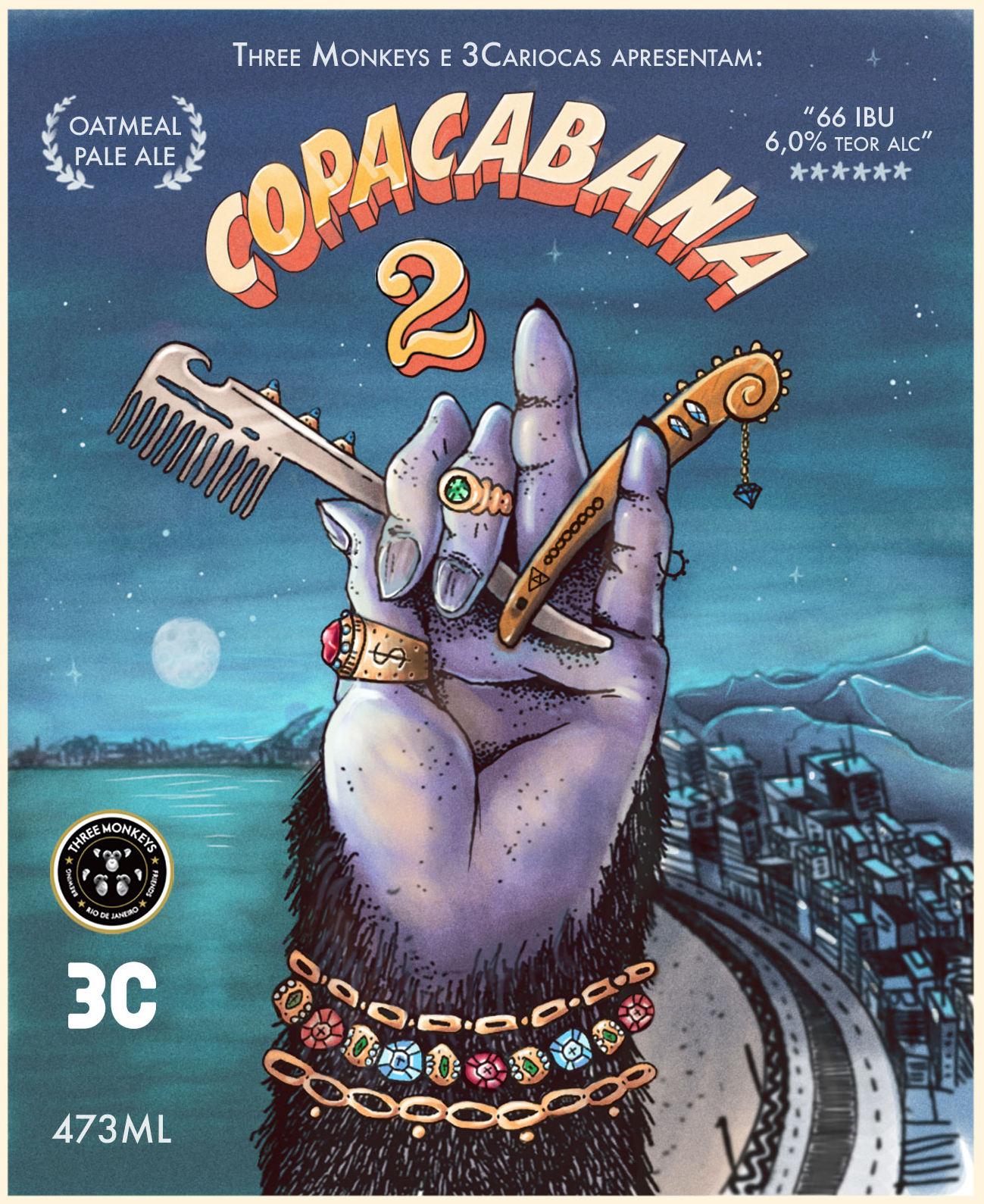
Copacabana
This was the first label we created together, back in 2016. Copacabana, a neighbour from Rio, has been a very popular location for indie movies in the 60s. The concept we came up was to make the label as a poster for a fictitious movie. Cadu Confort was invited to collaborate with parts of the illustration.
Later on in 2018 we redesigned the label to create the sequel: Copacabana 2.
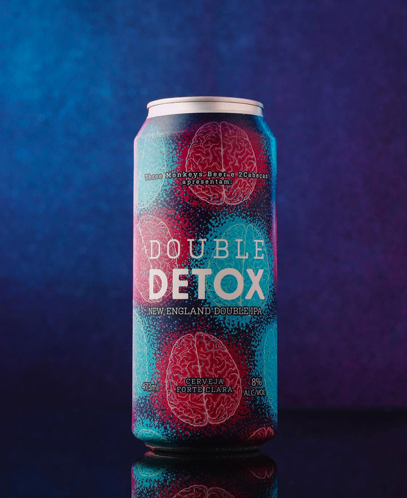
Double Detox
Detox started from the idea of expanding peoples comprehension of what a beer should look like.
Playing with the idea of the big trend from detox juices to cleanse the body. The goal of Double Detox was to promote the cleansing of you mind.
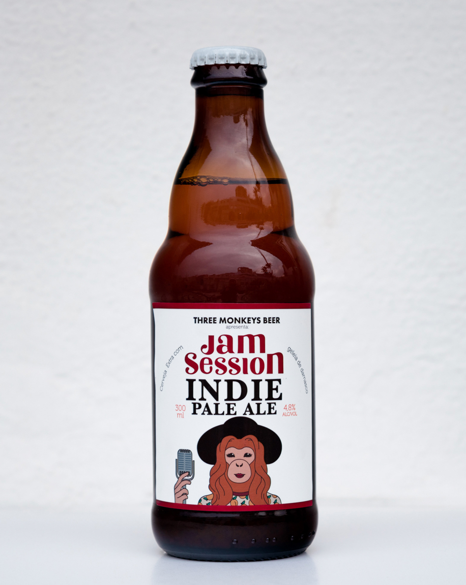
Jam Session
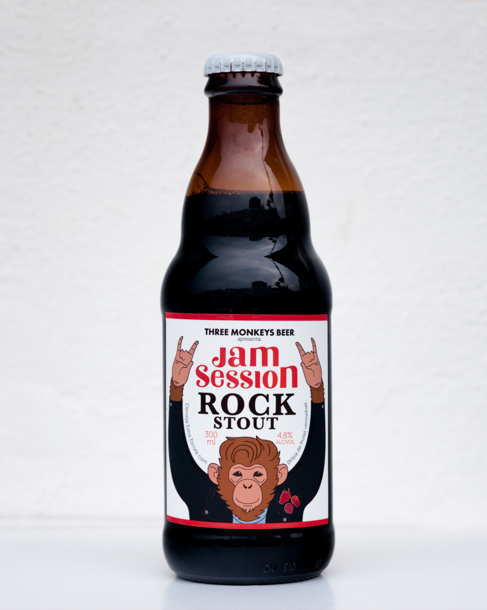
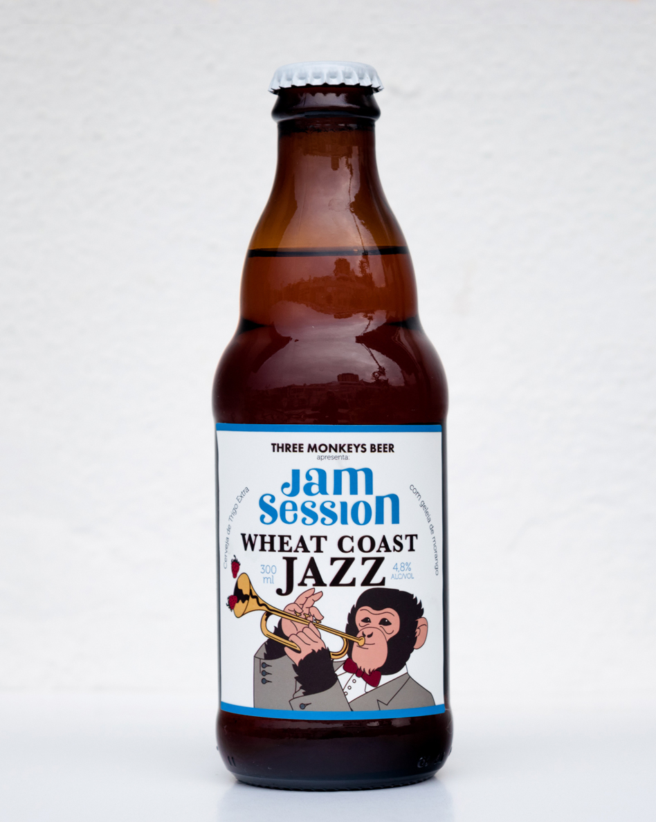
This set of three beers were developed for the launching of Three Monkeys Beer's first official event in 2017. They wanted to create a connection with the independent music scene from Rio by promoting jam sessions. To help bring people together and to spice up the idea the Jam Session labels each have a specific jam flavor as key ingredient.
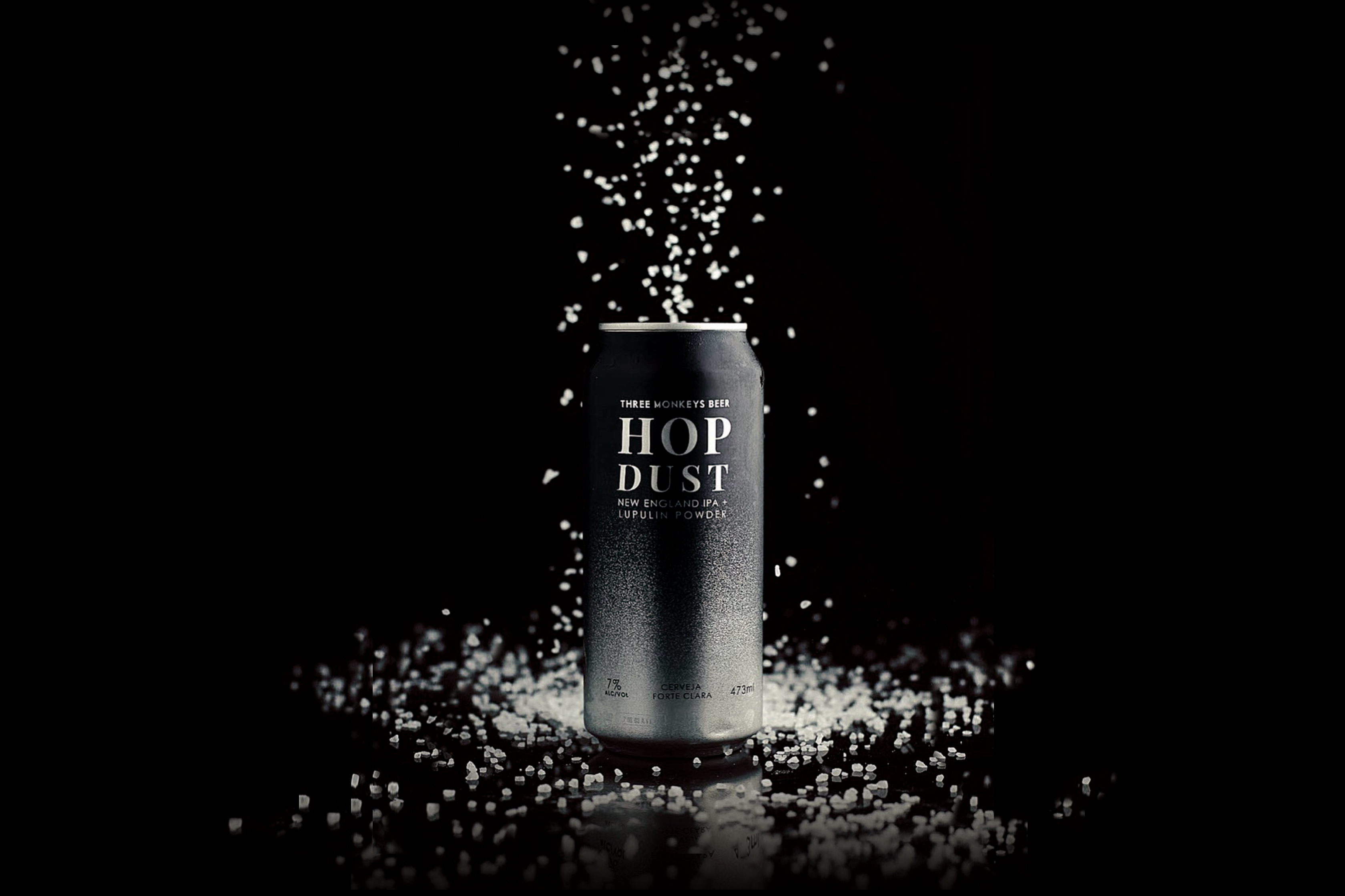
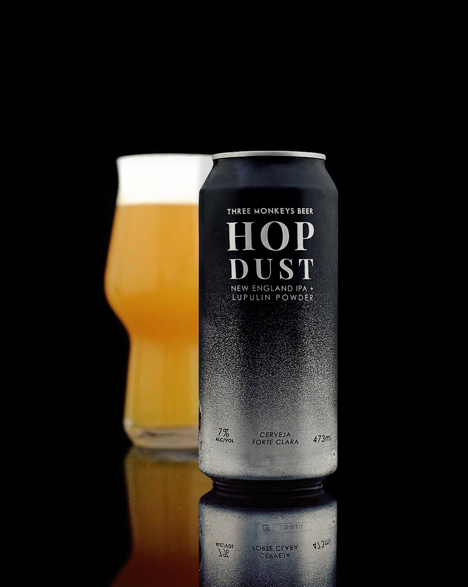
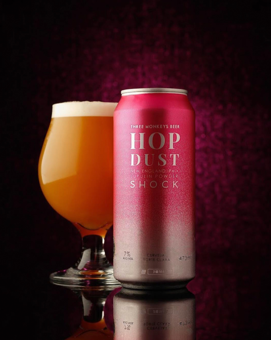
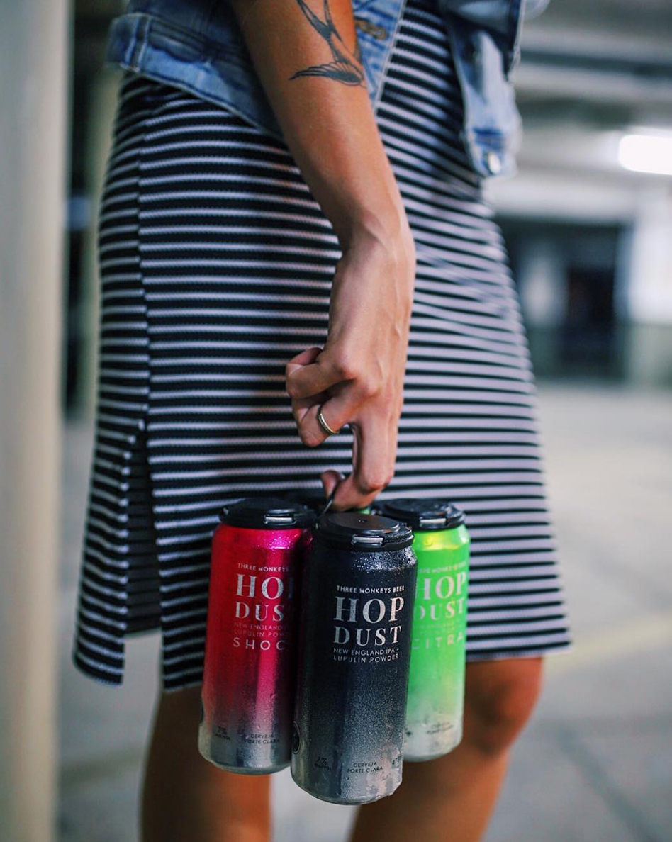
Hop Dust
The recipe for this beer was 'simple' yet they chose to do it with premium ingredients. One of the key ingredients was the Lupulin powder, literally a hop dust. The space theme has already been present in earlier labels we developed so we chose to embrace it one more time.
The briefing for this product was to standout. They wanted to make a statement. With the Futurism movement aesthetic in mind we focused in the elegance of simplicity we designed this packaging to standout by focusing in a minimalist approach.
