L'OR Ultimo
Born in France, L’OR is now a global coffee brand challenging premium coffee brands in providing exquisitely blended coffee at scale. By evolving the word mark and adding jewel tones and vibrancy to their striking black and gold, we repositioned L’OR as unapologetic pleasure.
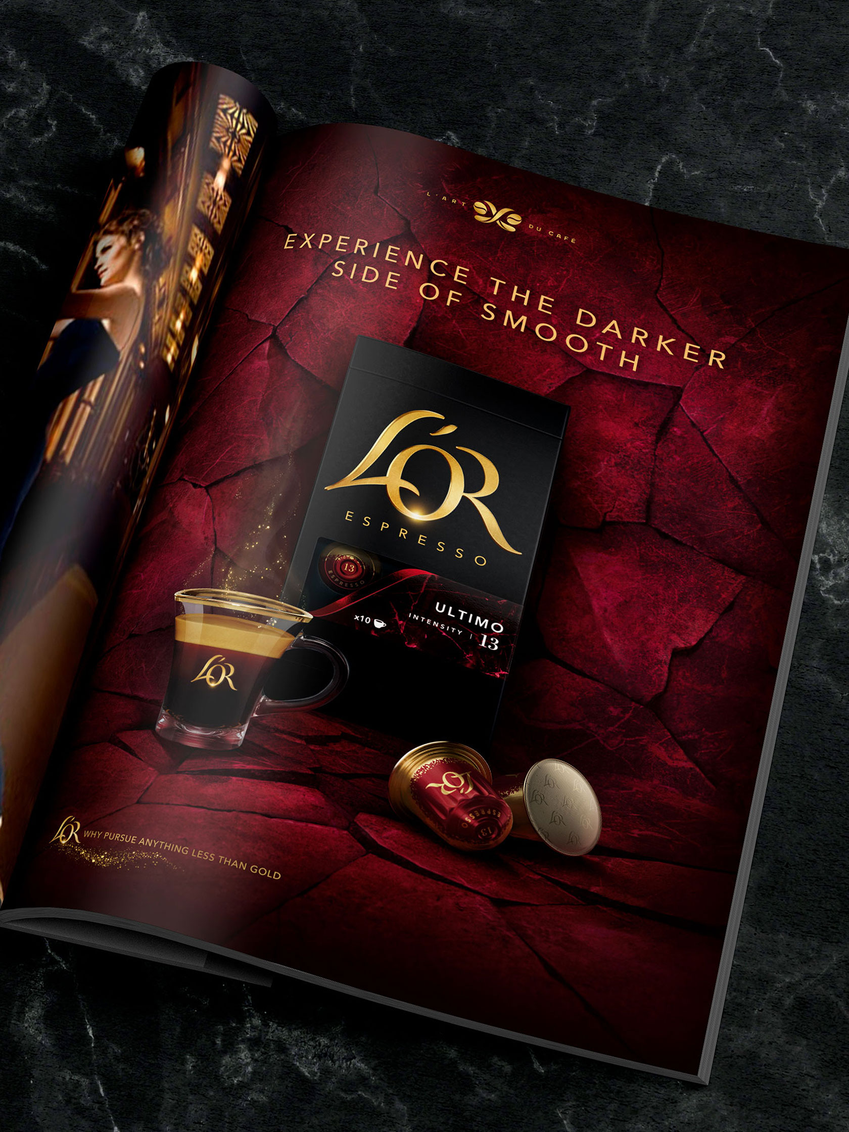
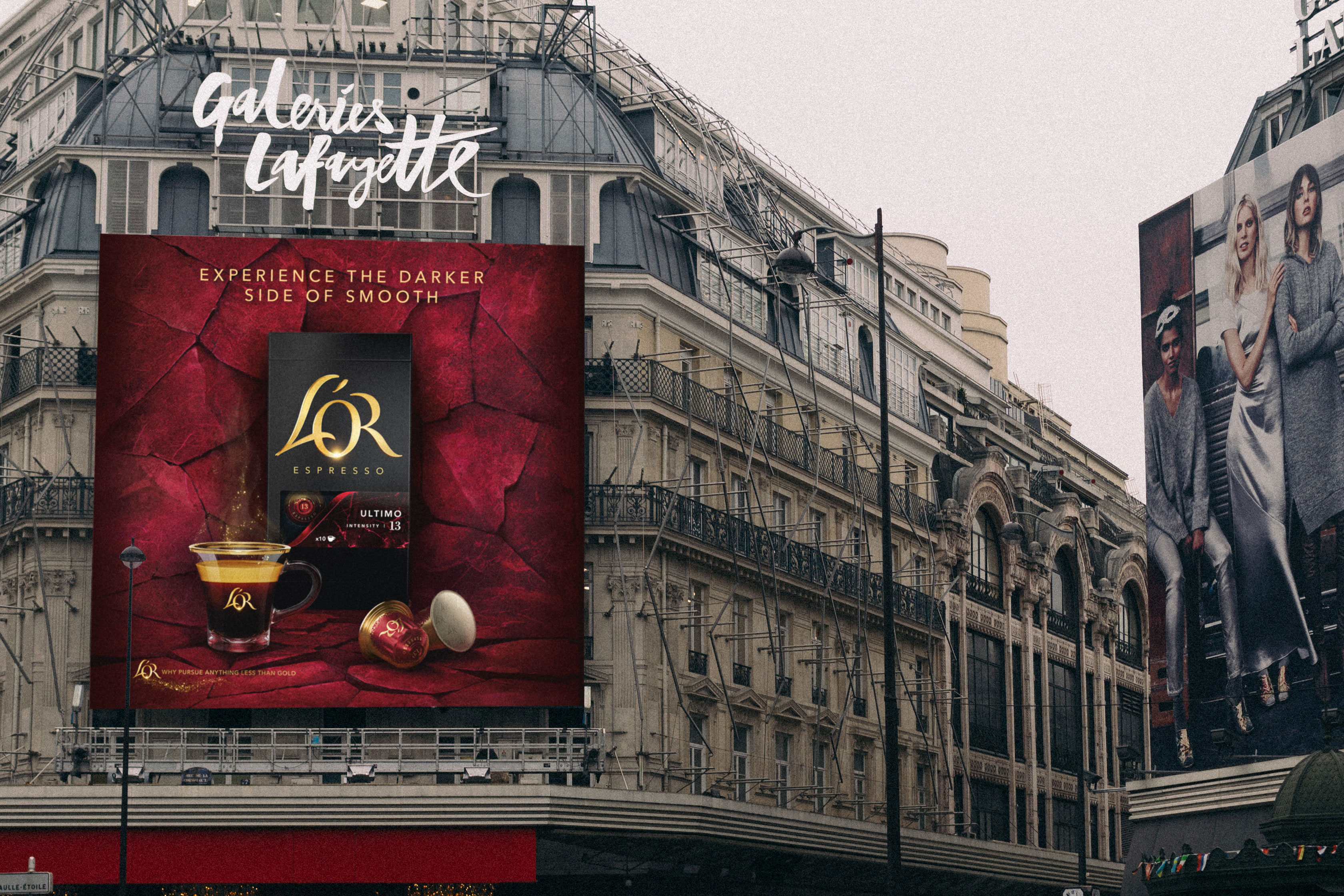
This specific project consisted of the development of the identity and story for the new and highest intensity coffee blend on the L'OR portfolio. We designed the packaging, the communication material in the form of key visuals both static and moving, other digital applications, as well as a comprehensive guideline to instruct the markets and other agencies on how to use these assets.
Role
Concept and Design
Agency
Design Bridge
Client
L'OR
Role
Art Direction, Graphic Design
Client
Unilever
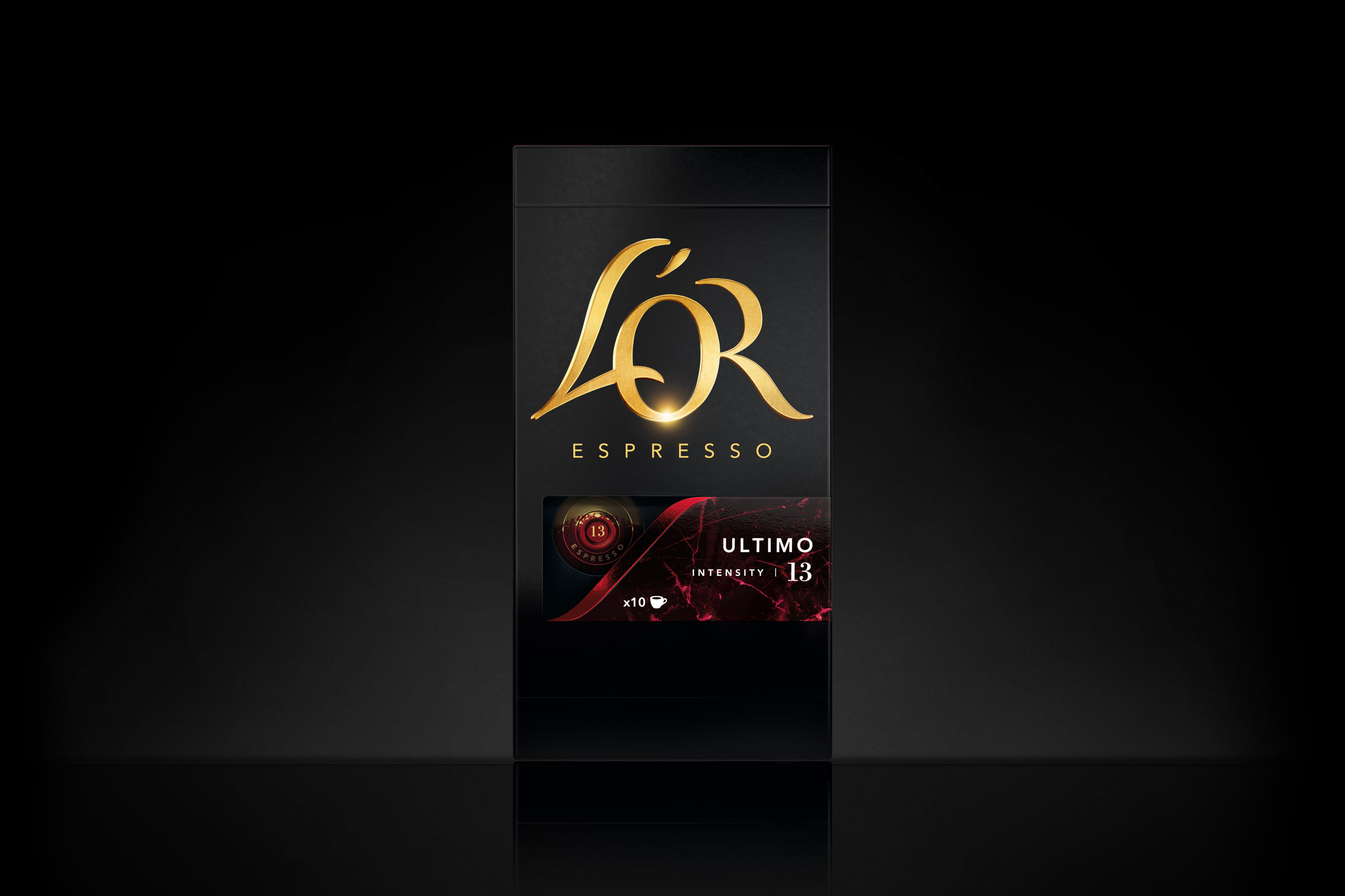
Having their existing blend 'Onyx' as a starting point for this blend expression and respecting the pack architecture of the L'OR base range. We explored the banner area to bring to life the concept of an extremely intense and smooth coffee blend. We conducted research on different mineral textures in order to find the best expression for the smooth taste and high-intensity profile of the blend. The final texture was inspired by marble and it's intense and dynamic veins.
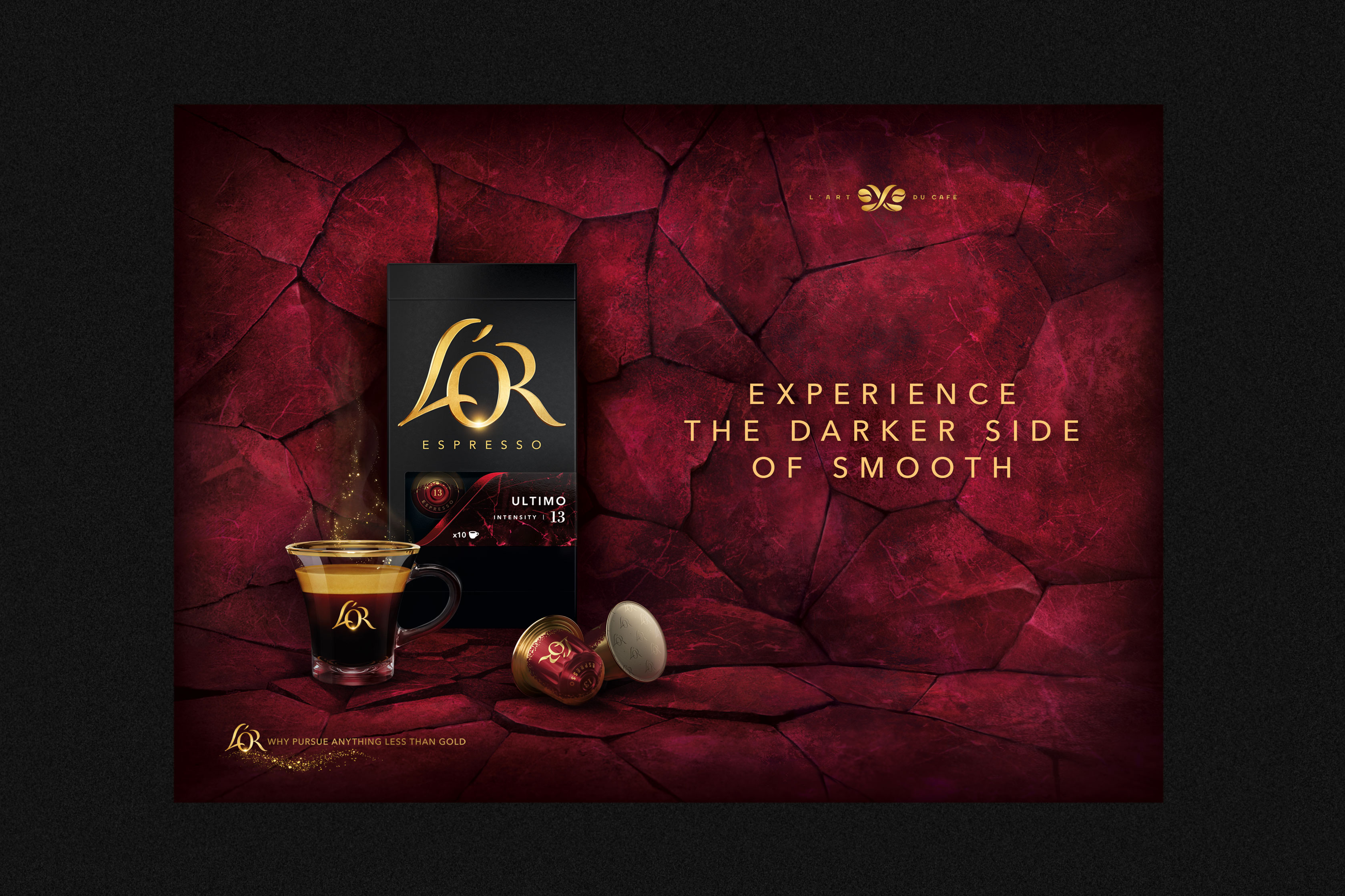
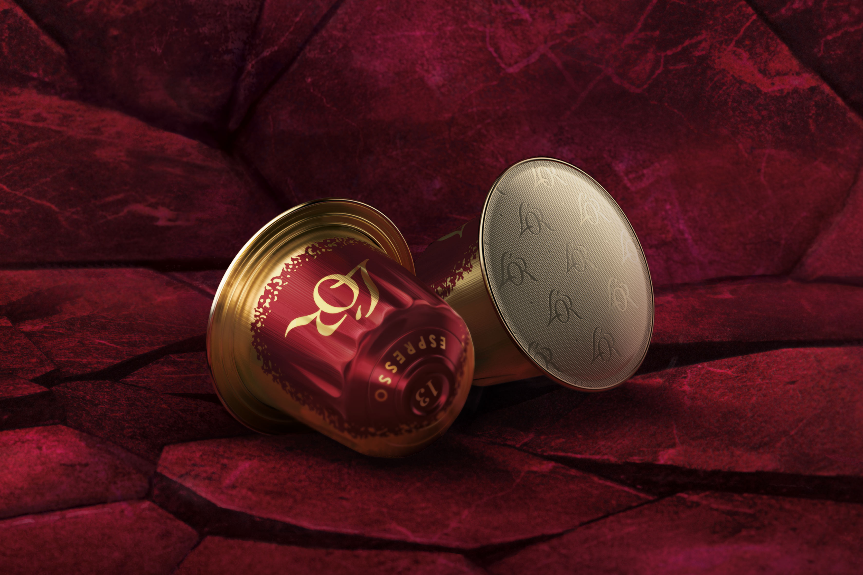
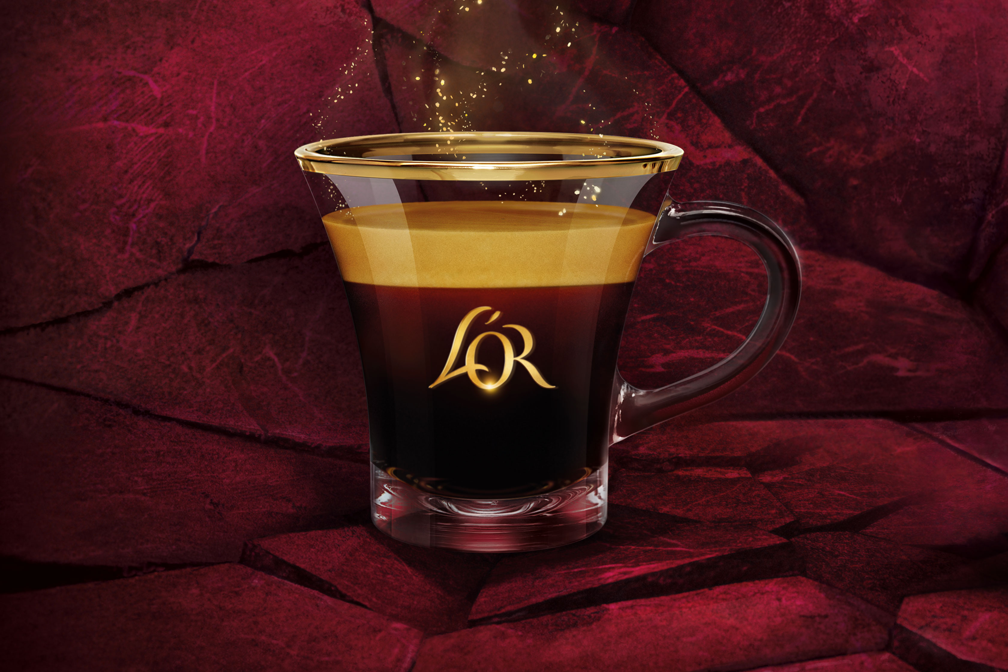
Challenging the current key visuals used for the base range of L'OR aluminum capsules. And emphasizing the distinctive L'OR capsule shape as well as the L'OR cup that is already used across several touchpoints of the brand. We created an expressive extension of the story of Ultimo throughout several brand touchpoints both in print and digital. Suggesting it's intensity by having the packaging, capsules, and cup break the vivid red marble texture that it sits on.
